Agile 2009: Many paths to the top of the (mobile) mountain
 Joh and I ran our workshop, "Many paths to the top of the (mobile) mountain", yesterday.
After our dry run at the Skiff, we had plenty of changes to make to the format - mainly tweaks, and many focused around preparation. This time we went in not only with a brace of wooden mobiles, but with laminated copies of device specifications, the personas, card cut to the right size for mobile screens, and handouts.
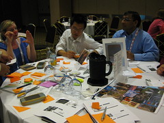
The workshop gathered 20 participants in total (a little over double what we had at the Skiff). We had quite a few turn up over the first 15-20 minutes of the 90 minutes we had allocated, and we'd planned to divide people into teams early on. The end result of this is that we had 2 teams each containing 8 people, and one further team of the final 4 to arrive late.
We divided mobile and UX expertise between the teams - mobile was fairly well represented, UX was *very* well represented with the likes of Johanna Kollmann and Helen Sharp in the room.
I gave a short presentation on the difficulties of dealing with mobile: fragmentation, diversity of usage contexts, limitations of battery life and low processing power, all the usual stuff. We then introduced a persona, Jeremy, and the exercise: Jeremy is a keen walker and wants a product to help him enjoy the great outdoors and share the experience with his friends and family.
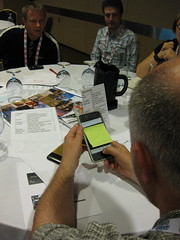
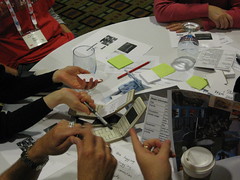
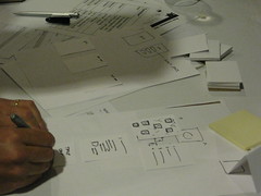
 With that, we kicked off a 15-minute design iteration, which had both teams being a bit more conceptual than in our dry run - perhaps a function of the teams being larger and more conversation being necessary to make decisions about what to do. Nevertheless both managed to get together a product for user testing - with each producing a broadly similar product concerned with tracking walks done and local attractions of interest. A couple of latecomers to the workshop were brought into the teams as fresh meat^H^H^H^Husers and run through the product so far, then gave their feedback. Both teams then presented their work so far, and learnings from the user testing, to the whole room.
We then brought in some change: the first team, who'd been working on an iPhone-like device, were told that Apple had gone bust and Nokia reclaimed their former glory, forcing 128x128 screened clamshells onto the world. The second team had been working with a stylus-driven device and were now given a large-screen mobile with a full QWERTY keyboard. Both returned to the drawing board, to take into account feedback from the user testing and redesign their product for the new device - in 15 minutes, of course.
 Meanwhile, we gave a new team composed of latecomers to the workshop a classic "candybar" format phone and asked them to design a product for this. They wouldn't get a second iteration, but they'd be able to participate, and had seen what both the previous teams demonstrated.
15 minutes later, we called both teams to a full stop. In our fictional situation time had run short pre-launch and so testing had been cut from the project. So we asked them to demo their products, and having done this, asked them all to consider a few questions:
- What have you learned?
- How did changes affect your design?
- What were the difficulties?
- What surprised you?
10 minutes later (and in a slightly rushed fashion, as the workshop neared an end - we'd been overgenerous in allocating extra time here and there throughout, which started to put on pressure) we invited the teams to present back what they'd learned.
The themes which emerged were:
- Completely forgetting the user: despite being in a UX session and having strong design expertise in each group, the teams had a tendency to be seduced by technical capabilities. They recognised this mid-session and corrected, but there was a sense of surprise at how easily they'd drifted off-course;
- Linked to this, the groups felt they should have done more user testing, perhaps in a guerrilla fashion even before going to "formal" user testing or to market;
- Perhaps as a result of the technology focus of the first iteration, the change of device completely changed the product for one team. The other felt that by focusing on a core idea, they'd avoided this trap;
- Time was short! Perhaps 15 minute iterations are a little cruel... ;)
Of these, the issue of time and the difficulty of moving between devices were echoes of feedback we had from the dry run. One of the groups this time around also starting thinking along lines similar to a previous group - considering how a user with predominately gloved hands might interact with a mobile app.
Other comments which came out from the anonymous post-session feedback:
- One said they were "impressed how much we were able to accomplish and learn in such a short time"
- A few attendees commented that they had a lot of fun - the buzz of conversation and the fact that, even assisted by a PA, I had to nearly shout to get groups to stop at the end of iterations had alerted us to this possibility :)
 So, next time around what will we change?
- With more time, we might plug some more design activities in - perhaps in the form of a third iteration or some pre-design concept work. A few folks at UXCampLondon felt this might be a good direction to go in, though we'd need to ensure each team has some facilitative UX expertise I think;
- We'll split into groups as late as possible, to allow stragglers to join, and to keep groups smaller. This time around we kept adding individuals to one of the existing groups when they arrived, bloating the size of them a little - each of the first two teams ended up with 8 people. I think smaller groups of 3-4 might get more done in an exercise like this, and more groups should mean more diversity in the apps produced;
- We'll title the session better! From feedback, we scored lowest on the session meeting expectations and on the topic matching content. Next time around I'd ensure the title was much more indicative of what the session contained; I found myself picking and choosing sessions from the programme on title alone throughout the conference, and a better title would help here;
We've a tentative invitation to run the session again for one of the attendees, and we'll be at OverTheAir in late September to use it (as a couple of dry run attendees suggested) to kick off the Hack Day.
Thanks to everyone who came along and participated, to Joh as ever for kicking it into a workable shape during planning and facilitation throughout, to my dad for making the lovely wooden devices themselves, and to the organisers of the UX stage, Angela Martin and Lane Halley, for giving us a chance to run it :)
Update: I've finally gotten around to putting my slides online here.