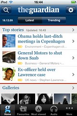
Guardian iPhone
So, I've had a few days now to fiddle with with Guardian iPhone app - and I'm liking it. In an attempt to stretch my ability for unbiased appraisal to snapping point, I thought I'd do a little comparison of it to our own (unofficial) Guardian Anywhere app, for Android devices.
Incidentally, we saw a nice little uptick in usage of the latter when the iPhone app launched - and we're currently cruising at 4000 downloads (with 1700 of those being active installs). Considering that our promotion for this was a blog post here, a single tweet, and a gloriously underfunded Adwords campaign (446 clicks delivered so far), we're pretty pleased.
 So, onto the comparison... looks-wise, I have to say I think the Guardian have done a much better job than us of replicating the brand, and the feel of print. The iPhone app feels like a newspaper, the Android app more like a database of stories. We've considered doing a more "papery" version for larger-screen devices like the Archos tablet, but it's unlikely to happen now - our attention is focused elsewhere for a little bit.
That said, I find the iPhone app a little "busy" - there's important navigation (search and settings) in the top corners, a navigation bar across the foot, a selector for latest and trending stories, and a feature that could be really useful (offline browsing) mixed into the foot of the main navigation. I could still find everything I wanted quickly (so my complaint feels a little churlish), but the overall sense was of extreme busyness - and I wasn't completely clear on the difference between "latest" and "trending".
Both apps make good use of the excellent pool of photography that the Guardian publish. But - and here's a key difference - from the iPhone app I can email a photo, and that's about it. On Android, I get the option to set as wallpaper or share the photo through a variety of mechanisms, highlighting one of the key advantages of the Guardian Anywhere (which is actually an advantage of Android as a platform): the interconnections between apps.
On my HTC Magic, I have apps for Facebook and Flickr installed. These apps then expose photo-sharing services to every other app on my phone - meaning that my copy of the Guardian Anywhere can automatically share photos with both of them, at zero effort for us, the developers. That's a really big win for me as a user: if I'm a member of a niche social network, my social networking app can help the Guardian Anywhere share content.
The same thing applies to the sharing of stories: I can post to Twitter easily from Guardian Anywhere, by virtue of having installed Twidroid. And I notice that within the stories themselves, links are stripped out on the iPhone (whilst being kept in on Android).
The iPhone app includes a whole load of audio content which is ace - I'm betting that more iPhone/iPod Touch owners listen to music on their devices than Android owners.
I was chuffed to see offline reading make it into the feature-set, though I can't help feeling that the value of it is reduced by the lack of running it at scheduled times in the background. One of the things I love about our Android app is that when I wake up, the news is already sitting there on my phone. With the iPhone, I have to tell the app to go grab the content now - which takes around 15 minutes. This just doesn't deliver the same sort of convenience, though lack of background processing on iPhone didn't leave the developers with any options.
I feel a mix of comfort and schadenfreude to see that downloading offline content takes about 15 minutes on the iPhone - it's the same for us on Android, and it's the number 1 complaint from our users. I'm confident that if the Guardian haven't solved this problem themselves, it's not so bad that we haven't yet...
And finally, there's distribution. I can't help but point out that the Guardian Anywhere is free, and available globally. £2.39 isn't an extremely reasonable price-point for such a high-quality iPhone app, but it's not available outside the UK, US and Canada. Whilst most of our users are UK and US, we have a sizable long tail in France, Singapore, Germany, Australia, and quite a few others, making up around 12.5% of our users.
It feels strange - a comparison of two very similar apps on Android and iPhone has ended up being a comparison of the platforms themselves, with iPhone delivering a superior overall look and feel (at a small but reasonable price) and Android making better use of background processing and connectivity between applications to improve the experience, for everyone.