HCI Diary: iOS Notifications
 So, one part of the MSc I'm sat on at Sussex is Human-Computer Interaction, which I'm being tutored in by Graham McAllister; and he's gently floated the possibility of our writing online about the course and our observations throughout it. So here goes; first up, we've been asked to look at iOS 5 from an HCI perspective.
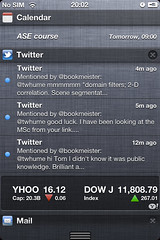
That's quite a big ask, so I've spent a few minutes running through one small but obvious new feature: the Notification Center which can now be pulled down from the top of the screen, and allows applications to request attention or leave quick-to-access information lying somewhere visible or constantly accessible.
I'll not mention the shocking similarity between this approach to notifications and the pre-existing Android feature; as Zach Epstein points out in a good comparison, WebOS at least demonstrated that there's room for something different, maybe even better.
Some observations about the Notification Center (NC) bar on iOS5, looking at it up close:
- It's easily found with the finger: Fitts's Law in good effect here, I can pull down from anywhere above the tops of the iPhone screen and drag the NC bar into visibility. It's quite helpful that the front of the iPhone is a single flat surface: there's no ridges to annoy whilst you run your finger across them, the whole movement of pulling down the NC bar;
- It's immediately useful: you can pull down the NC bar just a fraction and start seeing your most recent notification, then quickly dismiss. No need to wait for the whole thing to appear, or to completely obscure what you are otherwise doing with your phone;
- If you part-show the bar and then take your finger off the screen, there seems to be a subtle bit of logic going on to decide whether the bar should snap down and take up the whole screen, or snap up and disappear. As far as I can tell it works like this:
- If a single item in the NC bar hasn't been made visible, snap up and hide it on release (the logic being that if you've not looked at anything useful and have taken your finger off the screen, you're probably not interested in the contents of the NC);
- If more than a single item has been made visible and the last motion of your finger was downwards (i.e. you were opening it and had down so more than a minimal amount), keep opening the NC;
- Otherwise, snap it closed - you were shutting it anyway, right?
- Clicking on an item in the NC takes you through to the app that put the notification there, providing quick access to apps which need your attention;
- Other apps (weather and stocks, initially) sit permanently in the NC, at the top and bottom respectively;
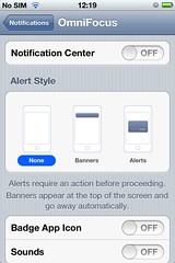
The other aspect to notifications is their appearance on the idle screen of the phone; again, configurable on a per-app basis. This brought back memories of a chat with a customer years ago; they were a mobile network operator and talked about designing for various personas, one of which was having an affair - in order to consider some interesting edge cases around privacy and floating potentially damaging messages onto the idle-screen.
The old "alert style" notifications are still available to users, on an app-by-app basis: an uncharacteristic abdication of UI responsibility from Apple, more characteristic of Android.
 Clearly useful stuff - I personally found the old notification system of modal pop-up dialog boxes irritating, as did many people. Possible areas for improvement:
- I can't seem to be able to dismiss individual notifications (though I can dismiss all from a specific app). With many apps populating the NC, it quickly becomes a long and crowded list; but having the ability to remove individual entries might engender a behaviour of "checking off" old notifications, making the whole feature more disruptive to everyday usage of your phone than it currently is;
- I can't do things from within notifications (e.g. reply to a Tweet), all I can do is sick on them to go through to the app which created them - though individual notifications can lead to screens within an app, so clicking on a Tweet in the NC bar takes me through to that tweet within Twitter. It would be nice to be able to perform basic operations on notifications, and there's clearly potential for interactivity there already: the stock application lets you drag the horizontally scrolling ticker around from within the NC bar;
