Launching Touchnote WP7
I'm a little behind on writing up some launches, including some work we've been doing over the last few months for UK startup Touchnote.
I met the Touchnote team at Mobile World Congress in Barcelona this February. Unfortunately for them, it was the day after the Swedish Beers party and I wasn't capable of much more than the odd shiver and groan, but we kept in touch and a couple of months later they asked FP to do a little review of their mobile products to date. We spent a few days on this, then a few weeks later had a call out of the blue from them: did we have any experience working with Microsoft tools? And would we be interested in helping them get their product onto the upcoming Windows Phone 7?
As it happened, a couple of our dev team had worked on XBox games and done some work with Blender in previous lives, so we had more than a passing familiarity with The Microsoft Way. Time was, as ever, tight, and so we kicked off simultaneous design and development efforts.
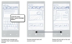
 One of the big problems Touchnote face is that prospective customers think their product is "just another digital postcard service" - i.e. don't understand that it's all about real-world, physical cards being posted. So we made a point throughout the UI of emphasising that a real postcard is being built up: after selecting their photo from their on-phone gallery the user is presented with a preview of how the printed card front will look. We then flip to the back so they can fill out the fields as they would in the real world: writing a message, signing it, adding an address to send it to — all performed on the card's reverse before presenting a final preview of the front and back.
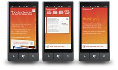
Colours were mostly dictated by Touchnote's (existing) brand, but combined these with a more natural paper-esque off-white - again, to emphasise that the user is creating a real postcard.
It was fun to explore what could and couldn't be done with WP7. It's so new that we couldn't just look at other apps to see what did and didn't work - aside from a few metaphors at the OS level, it's all up for grabs. So we were trying things out, seeing what happened and using/tweaking/throwing out as appropriate. Could we use images in the panorama header? How could we best transition users from one screen to the next? How should the back button function in various places? To a great extent, we answered these questions through trial and error, bouncing ideas between developers and designer.
We pared back the process of creating a postcard into key stages: Photo, Message, Recipient(s), and Preview, then developed a series of icons to clearly depict where the user is in the process without the need to use words (which also made it a lot easier when it came to internationalisation - the product is currently available in 8 languages). We used these icons both as an indicator and a navigation tool, so whilst you're being gently guided through the process, you can also skip around if you want to.
Meanwhile, our dev team tackled the two largest risks we could identify: getting integrated with the Touchnote back-end, and a WP7 app running. As the design effort proceeded, they put together a stub application: no user interface so a little ugly, but just enough to take a photo, post it to Touchnote and trigger the sending of a postcard. This was incredibly valuable: our first stub app taught us how to do threading properly in WP7 and let us fiddle with all sorts of parameters and networking code without having to wade through a user-friendly UI on every test cycle.
As expected nowadays in mobile, we ended up spending most of our time on UI and its polish. Early experiments with the panoramic parallax effect which characterises WP7 highlighted some unexpected limitations to do with maximum panorama widths, so there was a fair bit of back-and-forth between design and development as we dealt with this, learned about the types of animation that WP7 offered, and so on. We found the animation side of things quite straightforward - we found a couple of hours of noodling was all it took to get to grips with Silverlight - and similar in principle to the iPhone; in fact our early feelings were that on the surface of both the device and the SDK, WP7 is similar to the jabscreen.
 Other parts of the SDK which impressed us were the isolated application storage (good for bulk storage of data) and the by-name object storage, which serialises C# objects for you - very handy. Less fun was dealing with the tombstoning (assuming that your app might shut down at any second), but hey, this is mobile and we expect to be doing something strange to handle limitations of battery life and processor.
After some UX reviews internally, with Touchnote, and from the team at Microsoft, we took a bit of time to add some polish: updating the tile image for the Touchnote app icon to have the background of the last postcard you sent, and adding "finger signatures", to let you scrawl a little image which gets printed at the end of your message.
Testing presented a few challenges; no devices were available at the start of the project, and whilst emulator tools were quite reasonable, they weren't sufficient to let us simulate multi-touch UI. Prototype hardware arrived about half-way through the project, and then left the building again when we were burgled :( In general the prototypes were quite decent - a few device-specific problems were noted on them, particularly around rendering of gradients in image files. Compared to some we've seen (and we have a great deal of experience with prototype hardware) they were solid.
The Touchnote APIs also proved solid enough for us to work with, though with the common caveat that they weren't designed with the triggering of edge cases for test purposes in mind. There was a worrying incident which involved all the Touchnote servers becoming clam-obsessed, but I'm sworn to secrecy on that.
The tooling was broadly good (the debugging tools garnered particular praise), though frequent releases of dev kits meant downtime reinstalling them; documentation was of variable quality and APIs changed over time (early releases let you add elements to Hashtable, but not remove them). The support we received from Microsoft, on the other hand, was consistently phenomenal: Paul Foster, their Developer Evangelist, routinely went above and beyond the call of duty in supporting our effort. We've never had such good support from an individual at an OEM.
Microsoft haven't had the best track record trying to crack mobile, and there's still a great deal of work for them to do to make WP7 a commercial success, but we were pleasantly surprised by our experiences launching Touchnote onto the platform - and we're proud of the product. You can watch a review of it here ("pretty damn good"), or read this really nice thing that Raam Thakrar, the CEO of Touchnote, said to get his children back:
"Working with Future Platforms was really good. We'd had some pretty mixed experiences in the past with offsite development - and Tom and co have completely bucked that trend. They were fantastically easy to work with, came out with a great product, and really were key in our WIndows Phone app. We're really happy with their work - and I'd whole-heartedly recommend working with these guys.The process of working with FP was really refreshing - they knew how to manage us (with kid gloves when necessary!), giving the clearest guidance we possibly could. This made a very welcome change. They were flexible as well as being transparent - and that only served to delivering a great final product."
