Looking back at trutap
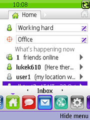
 At the Future of Mobile this last Monday we launched a new version of Trutap, one of the projects that's been keeping FP busy over the last 6 months. It's been a large project, involving 11 our our folks at various points through its lifecycle and a similar number of people at Trutap.
The brief was to rework and adapt the user interface of the original product, reusing the existing storage and communications components which we had developed in 2007 as part of version 1. Trutap wanted the new UI to support searching of their customer-base, increased emphasis on user profiles, and the addition of large numbers of third-party service providers. We wanted to push J2ME and our Cactus framework a little bit further, and experiment with a new approaches to addressing the problem of porting J2ME applications - but more on that another time.
The project started with a 1-month design effort, where we worked on some of the conceptual side of the UI (such as left-to-right navigation and a breadcrumb-trail like use of tabs) and started thinking about what components would be required to support this.
The former gave us the "big picture" which was bounced back and forth between FP and TT, iterating gently in the breeze. The latter allowed us to start making visible and worthwhile progress early. We started with a completely separate harness for UI components which let us develop and exercise them outside of the main MIDlet, testing them fully (even with edge conditions, e.g. "how does this contact look when their name is too long to show on-screen?"), before plugging them into our automated tests. As a side-effect, this enforced some good design principles: components are properly encapsulated, and we ended up reusing quite a few of them across the app.
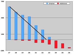
This was the first large project which has started, run and finished since we adopted Scrum for project management at FP a year ago. It's been both a learning process, and confirmation (for us and our clients) that Scrum works "in the real world" on large complex projects... on the subject of which, if you were at my talk at the Werks a month or so back, you would have seen a diagram that looked something like this:
It's the burndown chart that we used internally to track the progress of this project. The blue bars above the X axis show the initial scope measured in estimated hours of work, whilst the red bars beneath the axis show scope added mid-project - and the black line shows the rough path of the original project plan. Each bar represents work remaining at the start of a two-week sprint. So you can see the project was originally scheduled as 12 weeks effort (sprints 17-22), the initial scope was completed in just under 14 weeks, and scope added - particularly towards the end as we iterated over the messaging section - added 6-8 weeks onto the overall timescales.
You can see that clearly some sprints went better than others (resulting in better progress); internally we tracked specific activities against these sprints, and it's no surprise that riskier activities (more technically complex ones, or those relying on third parties) tender to go slower than well-understood ones.
Only towards the end did we start sharing this chart with Trutap. I'd previously felt a bit self-conscious about filling status meetings with graphs and charts - it feels a bit geeky - but I learned a lesson here: I wished we'd done this earlier, they found it a really helpful way to represent and understand the progress we were making.
Most of the project proceeded on an incremental basis, as we gradually migrated sets of features over from the version 1 interface to the new look and feel. This proceeded section-by-section: signup and login first, then contact management, messaging, profile management, search, services, and so on. At the end of each iteration (i.e. once a fortnight), we released a version of the product to their QA team for formal testing, though we were conducting QA as part of our development too; I was pleased to hear that Trutap felt quality of releases had noticeably improved since the first version of the product last year. In the final sprints we were releasing more frequently: their QA staff had direct access to our build system and could pull off new binaries as and when they were ready.
We iterated a little on messaging, spending a sprint returning and reworking the interface once our customer had had a chance to see how the wireframes we'd all theorised about worked on a real phone; and in the final sprint of the project we had another run-through, with the Trutappers coming down to sit alongside our development team and get last-minute pre-launch changes made.
Design tended to be done "just-in-time"; sometimes we deliberately anticipated components that would be needed for the next sprints work and undertook design for them in the preceeding sprint (in a classic "design-one-sprint-ahead" model), but sometimes we were able to work a story or two ahead and keep design and development tasks in the same sprint.
I'm deliberately not writing much about lessons learned in this post; we're having a half-day retrospective with the FP and TT teams getting together next week. I'll follow up this meeting with a post here summarising the day; and there'll be another piece coming soon on our approach to porting, which I touched on at the Future of Mobile.
In the meantime: congratulations to everyone at Trutap and Future Platforms (past and present) who worked on this. I love launching :)
