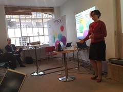
MEX, Customer Research Methodology Must Be Enhanced To Close The Reality Gap: Rachel Hinman, Adaptive Path
MEX, Failures of Imagination: The Role of Research in Mobile User Experience: Rachel Hinman, Adaptive Path
References an analogy between economic crisis, blamed on a failure of imagination amongst economists and policy-makers. User research isn't naturally associated with imagination either, it's seen as being about hard data.
But user research is often used to validate existing ideas: "tell me I'm right". Hypothesis vs agenda - a hypothesis opens up possibilities, an agenda leads to an attempt for proof.
 Mobile devices are "frankenstein technology", difficult for people to use. But mobile represents "an opportunity to invent new ways for users to interact with information". Mobile devices are a tangible way to explore these new ways, as opposed to intangible ubicomp stuff. But we need to acknowledge our agendas when coming to this stuff - and be more explorative.
Rachel's presenting three examples:
Expert Interviews, for a handset vendor looking at future of UI 3-5 years out. They didn't want to talk to mobile industry experts, but people at the periphery of mobile - those connected to it but with some other specialism. e.g. Bruce Sterling, Adam Greenfield (talking about mobile devices as wands, helping us choreograph our interactions with the world). The wand metaphor comes up again and again.
Took everyday objects (e.g. magnifying glass) out into the street and pretended they were mobile devices. Pipe-like devices lead to metaphors about pouring data (reminds me of the Siftables presentation).
Deprivation Study from 2007 - about accessing internet content on a mobile. Shows video of users talking about accessing content mobile-ly; they note that mobile is different and might need different, tailored UI. Quoth one: "It's called surfing for a reason - it's about a flow".
Design principles arising from this research: craft mobile interfaces that speak their power (i.e. use affordances to build intuition); dismantle the page metaphor (which is brittle: if web pages are boulders, mobile elements are pebbles); and cope with partial attention.
Decrypting Context; it's hard to grok because it's complex. How do you design for anything and anywhere? "It's about understanding human relationships to people, places and things in the world". Relationships are semantic (based around shared meaning), social, spatial or temporal. These relationships rarely occur in isolation.
Example: peanut butter has a spatial relationship (it's in a cupboard at home, or in a certain place in the store); a temporal one (probably have it on toast in the morning); a social one (she's on the Flickr stream for it and has heated arguments with friends about it); and a semantic one (when visiting Japan she'd need to know the word for it and would have to pantomime it).
How can a mobile help Rachel get peanut butter in Denver, NOW?
Mobile is better than a PC for spatial or temporal relationships because you can physically move it to relate to the world... and because it's available to a greater degree.
See also Adaptive Path on Mobile Literacy and Rachel's slides on SlideShare.
Q: There's a lot of research on how usage patterns differ by age. Aren't children closer to the future than we are?
A: I think Africa is probably nearer. If someone's carrying a baby and their phone, this shifts social structures. It's not about technology and device, but how it's shaping how people do stuff.
Q: Intrigued by wand analogy. Harry Potter had some usability issues!
A: Adam and Bruce both said they liked the idea it evoked, but the challenge was that there's a mystery element to it, a sense of uncontrolled sorcery, which may not be something you want to put out for users. A conductors wand is probably a better metaphor.