MobileDesign
MobileDesign was pretty darn good this evening. It was the first time I'd been - which I now regret even more - and with an excellent crowd (familiar and new faces), lovely venue, and good speakers (ahem) I was most impressed.
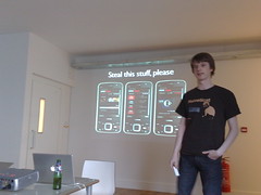
 I particularly enjoyed Nick Richards' talk on the work he did at Fjord on the BBC iPlayer. Nick exhorted us to steal all we could from Auntie, and I came away with a few notes of interesting stuff:
- They designed for 5-way navigation (up/down/left/right/fire), not 3-way (up/down/fire); horizontal navigation allowed them to increase the density of information on-screen - a key goal of the project;
- Repetition of imagery between its selection (in navigation) and presentation further down, to reassure users they'd made the right choice;
- "Light personalisation" through areas of the screen which expand on clicking, and whose state is remembered;
- The importance of "resume" functionality when your user sessions are typically 15m long and programmes average 30m;
- Targeting specific high-end devices only;
- Use of click-to-send smsto:// URLs and iCal format events to save into the on-phone calendar;
- Thinking carefully about what happens when constraints loosen - e.g. when those 900 hours of content increase to 9000 in future;
- Implementing pages as sequences of modules, each of which had a fall-back "low-end" version, instead of having a "hi" and "lo" version of the site as a whole;
- Weekly iterations with user testing every week, and how lovely the BBC are to work with;
- Full customisation didn't make it in to launch;
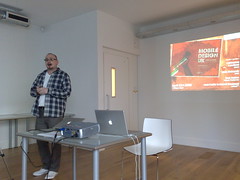
 I did the following talk on "knocking down walls between designers and developers". I wasn't happy either with my delivery or the overall content; I felt it should've been less of the "designers and developers should just hug each other"-fest it felt like at times - a truism I don't see much point in repeating; that I should've drawn on more specific experiences we'd had at FP (we're not short of them!) rather than making general sweeping statements; and I shouldn't do a talk when I'm half-asleep after a planning day... slides are here, anyhow, if you want to see some kitty photos.
The UsTwo guys gave a very nicely-done presentation about personalisation and future UX, which I really enjoyed despite dozing off within - would love to see it again.
Thanks to the Yiibus for all their efforts in bringing this together, and to Seren for having such a wonderful office :)