Tools and shapes
April 13, 2012 | CommentsWhen I first started blogging, I used a quite esoteric product (for which I developed a great fondness) called Radio Userland. I can't remember why I stopped using it, but at the time I found myself jotting down lots of short-form thoughts. My style of writing was very different to the longer pieces I do nowadays, and in part I put this down to the lurking "Title" field that TypePad includes: it suggests a formality to individual posts.
But I quite miss being able to throw out any old idea. The conciseness of Twitter makes it great fun, but it's an awkward place to carry out conversations and sometimes I want a little more than 140 characters… so I'm going to start putting shorter-form stuff over on my Google+ stream. I'm also cross-posting longer stuff there, to see how that works too.
Jakob Nielsen on Mobile vs Full Sites
April 12, 2012 | CommentsJakob Nielsen just posted Mobile Site vs Full Site. Like much of his writing, it's provoked a critical response from web designers. Most of this criticism is for suggesting separate mobile sites; suggesting mobile is a separate use case; and not mentioning techniques like Responsive Web Design. I've not read the full report (as, I suspect, most critics haven't), but I think it's a bit unfair.
As he clearly states in the first 8 words of the body of his article ("Based on usability testing of hundreds of sites…"), his advice derives from observations of real user behaviour - often a rich source of uncomfortable truths. NNG observed users accessing existing web and mobile sites on a mobile device, and where there was a mobile-specific version, they found it easier to use. It's rational to conclude from this that there ought to be mobile-specific versions of content.
He is unhelpfully specific as to how this should be done ("If mobile users arrive at your full site's URL, auto-redirect them to your mobile site"). I think if I read that literally I'd be tempted to disagree with the detail of implementation, but find it hard to argue with the intended effect. From the end-users perspective the advice is valid: give mobile users a mobile representation and let them switch representations if there are features on the desktop site not present in the mobile version, that they wish to use.
How this is achieved is a different matter, and a point on which he's quiet, if not silent: leaving room for multi-serving, RWD, RESS, or other approaches (in a follow-up interview by .Net magazine, he suggests all three). A user can't be expected to notice whether the site they're accessing works well by virtue of its being responsive. They are unlikely to care whether it was produced by a server using separate templates for different representations of content, or some other mechanism.
He talks of a "mobile use case", but if you look at the detail of what he suggests it doesn't seem so contentious. To suggest that mobile sites should avoid esoteric features without limiting core functionality is valid: Amazon, Google and eBay all do exactly that; even a textbook example of responsive web design like the Boston Globe hides some content (the "social" links are hidden and revealed by a "More" link next to the Tools section of the footer). If Nielsen is basing his advice on observations of users, I would expect that they have demonstrated such an approach to be a good one.
The challenge, as he clearly points out, is finding the "cut between mobile and full-site features in such a way that the mobile site satisfies almost all the mobile users' needs"; and this is the crucial "it depends" get-out which gives Nielsen and his critics the wiggle room to find agreement.
Holiday in San Francisco
April 09, 2012 | Comments"Put down the pen someone else gave you. No one ever drafted a life worth living on borrowed ink. Get to San Francisco. Get to San Francisco in defiance of your geography, your ancestry and the lonely change rattling sad excuses in your pocket. Fuel up on pie and diner coffee and mystic visions and the freedom of not knowing what’s coming next except that you’re burning the road to outrun it"
I've just arrived back after a wonderful couple of weeks in and around San Francisco, and despite that vague sense that I don't know what day or time it is, I'm buzzing. We kept busy. There's lots I want to remember. Here's a list. Everyone likes lists.
- Clowns everywhere: clown dogs, glass clowns, terrifying mexican clowns, beat clowns and an in-the-street encounter my iPhone managed to lose;
- We stayed the first few nights in Henry Street, by the Castro. Nice area; very Brighton vibe;
- 826 Valencia scored two visits: 20 minutes wandering around, poking stuff, giggling;
- Gorgeous street art was everywhere. I'll not want for desktop wallpaper for some months;
- Popped into SFBeta on the second night. Liked what I saw of SendGrid (simple; boring but necessary; well-presented by staff who knew what they were talking about). Kinda disappointed by a couple of the other startups: folks there just didn't know basic facts about the businesses they were representing. The venue was great, there's bags of enthusiasm in the air and it felt well-organised, but also like the edges of a "scene", rather than a set of people uniformly out to change the world;
- The Creme Brûlée Cart. I can't add anything to that - amazing;
- The California Academy of Sciences: lovely museum, I particularly enjoyed the temperate environment they'd set up. Walking through humid air surrounding by large, colourful butterflies was a magical moment;
- We walked across Golden Gate Park, down to Ocean Beach and hung out with Pete and friends. I'd not seen Pete for years, and his friends (also employers) were lovely. Felt slight envy over an office from which one can see passing whales tho;
- Lots of wandering around different areas of the city, sampling the atmosphere and gasping at some of the properties;
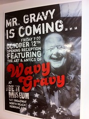
- The Beat Museum, a scratched draft of Howl, and musty newspaper clippings;
- The seals at Pier 39 performed for us on several occasions. Down in Monterey, their cousins welcomed us back from a boat trip;
- We walked out along the coast, past the Golden Gate Bridge and to the Sutro baths;
- The Palace of Fine Arts had a couple of visits, one in cloud, one in sun. It was one of the high points for me: an elaborately constructed faux-roman ruin, build to crumble and reinstated after popular demand;
- The Japanese Garden and Arboretum in Golden Gate Park took us for another afternoon;
- The street performer who we wandered upon just south of the Park, balancing on a basketball, soulfully singing and whistling along to her accordion: we were spellbound;
- The Wave Organ at the end of the pier; it wasn't so tuneful when we were there, but a thing of beauty nonetheless;

- We suited up with SF Giants gear and went to our first baseball game, scratching at school-day memories of playing Rounders in an attempt to understand wtf was going on. I loved it, and I can't really tell why;
- I ate a Bear Claw. OK, it's a pastry;
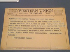
- MOMA had an exhibition about Buckminster Fuller. I knew nothing about him. Now I know next-to-nothing, and have a few more books on the wish list. I think he had Burroughs write his telegrams;
- We found the concrete slide off Seward Street, procured wax paper, and propelled ourselves down it, swearing as quietly as possible;
- A tour around USS Pampanito: 5 minutes under the waterline was enough to persuade me that I am claustrophobic, after all, and would make a crap submariner. A gentleman on board told us an horrific story of an accidental sinking of 2000 Allied POWs. I remembered the Glowworm;
- It turned out we were staying 5 minutes from the Long Now Foundation. Who'da thought it?
- Dinner with Robert and some of his chums one night, and a private audience with the snaffler the following evening, both in lushest SOMA. Coincidentally, discovered a whisky I like;

- We drove out of town and south along the coast - past the most beautiful coastal scenery I've ever seen. Beaches, caves, waterfalls, railways;
- We popped into Carmel, and loathed it instantly;
- Two nights in Deetjens Inn at Big Sur: wandering down to beaches and into the woods by day, stuffing ourselves by night;
- We learned that nothing says "Hope" like a wooden chicken pushing a wheelbarrow full of apples, labelled "Hope";
- We also learned how to avoid, or attract, a mountain lion (which one you get depends heavily on whether your desire to see a mountain lion outweighs your desire to lose a small child);
- Popped into Esalen for a couple of hours in a hot tub and a massage. Could have become a hippy and stayed;
- I loved the beautiful pavement poetry in San Francisco (even if I didn't like the poems themselves, it was a bit more committed than "Poems on the Underground"), and we found poetry of a Vogon standard around Big Sur;
- Went whale-watching off Monterey. Saw some whales from a distance: interesting, but not really close enough to be all that meaningful;
- And then there was the food. We ate out, prodigiously, and never once had a dud meal.

So, err, pretty darn great then. "San Francisco is just like Brighton", they say. Well, They are wrong: it's a boatload nicer and more diverse, and the comparison is one I've only heard this side of the pond. I've stuck all my photos here so you can see for yourself.
Apple are about more than design
April 03, 2012 | CommentsThere's a meme that's floated around for a few years now without being challenged, and it's that the success of Apple is explained by their focus on design, in particular through the work of a couple of in-house geniuses. The idea that their success is explained by the individual genius of Ive and Jobs is a convenient myth for them to encourage, but I don't think it's the whole story. And they don't think so either: witness the efforts to systematise their success by setting up an internal university, or Tim Cook's assertion that they don't share details of their process because it's part of their competitive advantage
Rather, what makes them scary, and probably fun, to compete with is that they do very well at very many things. Design is a part of this, but their software quality is good relative to their peers: witness the flood of developers moving from Windows to BSD-based MacOS in the early 2000s. They have done incredible things logistically (there's a good tale in the Jobs biography about their buying up capacity on air freight to get iPods delivered, I think). Their marketing is clear and consistent. And so on.
I don't mean to eulogise them here. Not everything they touch turns to gold (just look at Ping, or iAd) and I find the regulations and control around the App Store a little hard to stomach; they feel like they lead to a slightly cloying Disney-like experience sometimes. But the idea that to succeed like Apple, you just need to "get design" and have a few solitary geniuses? It's inaccurate and naive.
If it's walking like a duck, it should quack
March 25, 2012 | CommentsI'll start by saying it: I don't understand what the fuss is about skeuomorphic interfaces. Or rather - I understand the fuss, but think it's misplaced. And there /is/ lots of fuss - it seems to be second only to Comic Sans in its notoriety in design circles just now. Witness Adam Greenfield ("somebody in Apple’s UX shop has saddled them with the most awful and mawkish and flat-out tacky visual cues"), or Clive Thompson in Wired ("skeuomorphs are hobbling innovation by lashing designers to metaphors of the past").
I've been collecting scattered thoughts and conversations about it for some time now. Hearing Jack Schulze defend it during a talk he co-presented with Timo Arnall at St. Bride's has spurred me into drawing this material together into a post.
Skeuomorphism is nothing new, as I learned during a chance conversation with Jo Rabin and Alex Craxton during post-MoMo pizza last year. Jo referenced the Doric columns of ancient Greece, which sported fluted shafts inherited from earlier wooden columns. In the originals, the flutes improved the strength of the structure and allowed for draining; once wood was abandoned these concerns were moot, but the form remained. Alex talked about Jugendstil, which used symbolic features on buildings that referred back to classical as well as natural form. And Alex G popped her head above the parapet just recently to comment that skeuomorphs remind her of paintings like those of the Flemish primitives, or even illusionism:
"either the artistic tradition in which artists create a work of art that appears to share the physical space with the viewer or more broadly the attempt to represent physical appearances precisely – also called mimesis"
Skeuomorphism is often rejected on the grounds of taste ("it looks tacky") or generates despondence from its shackling of digital interfaces to old metaphors. The latter offends for two reasons: the resulting interfaces are limited by their chains, and the approach is inherently backwards-looking. I can imagine similar views being expressed in architecture and art quite easily.
(In an attempt to depress still further, Jo also pointed out that we're seeing double-skeumorphs in some places: "the form of the iCal interface mimics a leatherette desk set - itself a skeuomorph of a proper leather bound one")
I think Adam's points are good ones, actually: as time goes on, it's clear that the digital metaphors we use for physical content become increasingly inappropriate. You can see the music and publishing industries struggling with this right now, as they try to sell easily-duplicated digital songs and books as though they were hard-to-copy physical items. The street finds its own uses for these metaphorical gaps.
But even so I'm not convinced that skeumorphism is a bad thing. Watch Apple, the doyen of the design industry, take this approach in so many places that it can't be considered experimental or accidental: Newsstand, Find My Friends, Calendar, Address Book, probably others. Apple aren't perfect (cough Ping cough), but when they make such a deliberate and contentious choice across many products, I believe it's worth lending the approach some credence and trying to work out what they're up to.
At the BERG talk, Jack laid out a spirited defence which I completely buy: skeuomorphism is a justifiable and inevitable approach to take when the interactions in your interface are direct-manipulative and use physical metaphors. If they behave as though they are real things, should they not appear like real things? To paraphrase his point: if it's walking like a duck, it should quack.
I also find this line of reasoning supportive of my emotional response to skeuomorphs: on the desktop I find the hardback feel of the address book tacky; on a touch-screen device I find an almost-identical interface absolutely fine:
As Apple push computing beyond the creative industries who provided their early adopters and into the sweaty palms of the mass market, I think The S Word will become more appropriate. Pascal Raabe defends the approach in a recent article on the UsTwo blog, noting that "texture and physicality give clues as to how an interface works" (just look at the bevelling or brushed metal of modern UIs), as well as the pitfalls which arise when the expectations thus created are broken. It's easy to watch novice computing users and observe that they seem much more inclined to experiment, and make sensible first choices, when using iOS devices than when using desktop Macs or PCs. And as Marek pointed out in a chat after the BERG talk, end-users don't seem to find skeuomorphism as contentious as some of us working on software and interfaces.
Oh, and one thing I hope that critics and supporters of skeuomorphism can agree whole-heartedly on: as Matt pointed out, you don't half feel clever trotting that word out.
Update: Alex has posted some of her thoughts, explaining the illusionism side of things better than I have.
