Links for thinks
November 13, 2011 | CommentsIt's been a while since I posted a link-dump, so here's a few that have popped up on my radar recently:
- A brief rant on the future of interaction design: "I call this technology Pictures Under Glass. Pictures Under Glass sacrifice all the tactile richness of working with our hands, offering instead a hokey visual facade.";
- The social graph is neither: "…we have seen the Web, and we have tasted of the blogroll and the lolcat and found that they were good";
- How people use tablets and what it means for the future of news: " A plurality of tablet news users (40%) say they get their news mainly through a web browser. Another 31% use news apps and the browser equally, while fewer, 21%, get their news primarily through app"
More nuances in Native vs web
November 09, 2011 | CommentsI'm collecting signs of people looking at things a little bit differently, when it comes to building mobile apps (mindful, of course, of Kirin, our approach for this). Here's a few I've come across:
- TheNextWeb, commenting on the launch (and subsequent withdrawal) of the GMail app for iPhone/iPad: "…some people pointed out that although Gmail’s app uses web view, it’s wrapped in a native wrapper – effectively giving us the worst of both worlds."
- Matt Asay of Strobe (just acquired by Facebook) writing in The Register, talks about how HTML5-for-apps is playing much better in the enterprise, where traditionally user experience has been seen as less important: "And while HTML5 still struggles to deliver as slick an experience as native app development with Java (Android) or Objective-C (iOS), this isn't much of a factor behind the firewall. Enterprise IT is mostly concerned with delivering a good enough user experience on a cross-platform basis."
- Sticking with Facebook, ReadWriteWeb posted an insight into their approach to mobile apps: "instead of the phone saying I am rendering for a WebKit browser, we send an agent that says you are going to be rendering for a WebKit UI WebKit view inside the iPhone app. So, what you have to do is detect that, style a Web code to make that work, build a bridge between the things that you want to write to interact natively with the Objective-C, say in Javascript, then build HTML pages for Facebok in the iPhone. So, you build much smaller native goop instead of having to build over and over again.".
HCI Diary: Observation of public transport
October 30, 2011 | Comments At our last HCI seminar, Pejman asked us to think about commuting, public transport, and the travel experience; consider a small part of this experience, and do some observations on it. So I wandered up to Brighton station at lunchtime today, to nose around.
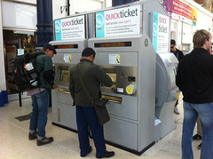
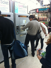
I didn't have a clear idea of what I wanted to observe, so walked towards the station with an open mind, looking for something interesting. A few groups stood around outside (stations being natural meeting points), and as I walked past the two ticket machines at the station entrance (with a queue of 2-3 people at each) and towards the 5 machines inside the station (with at most 1 person using each), I thought I'd look at ticketing.
Some of what I saw:
- One lady walks up to the ticket machine, after a previous customer has walked away. The ticket purchase is in a half-finished state; she's obviously confused and has to look around the screen to see how to get "out" of this purchase (fix: detect when someone walks away and stop the process for them. Provide an "undo" for those times when the detection fails);
- When making a purchase, several people would not start looking for their credit card when first asked for it - introducing a delay as they went through purse and pockets (fix: see if it's possible to move the entry of credit card to the start of the process, encouraging them to have their cards ready as they queue);
- There was a common behaviour amongst many ticket purchasers, of scraping their hands along the long ticket-delivery channel towards the bottom of the machine: making sure they had all their tickets, every coin of change that had been dropped down there, etc. (fix: smaller slots for delivery of coins and tickets);
- When asking for a destination, the machine displays a keyboard on its touch-sensitive screen, and tries to help by listing all the stations which match what has been typed so far above it, and greying out keys which don't lead to a valid station name. In practice one man had trouble with this: between every key press, he would direct his gaze up, scan the list of stations, realise his wasn't on there yet, scan down, find the next letter of his station, scan up, and so on. Quite slow, and frustrated further by the lack of feedback for any successful key-press and the poor ability of the ticket machine to register key-presses (fix: some sort of feedback, visual or haptic, for a key-press; allow pressing of any key at any time, to lessen the need to glance down to keyboard? Needs more thought);

- I saw a couple of instances of two people using the machine at once, one helping the other;
- Another behaviour which popped up was queue negotiation when two machines were next to one another. Was one queue forming for both machines, or one for each? Wordless gestural conversations between queuers and new arrivals seemed sufficient to settle this one;
- About half the people I saw buy a ticket immediately headed towards the concourse, their heads up and scanning the list of departures to find theirs; why not show the next train for the ticket you've just bought on-screen?
- There's a clear and slightly frustrating delay between a customer tapping in their PIN number and receiving their ticket, whilst the ticket is printed (fix: print tickets immediately they're demanded, only hand them out once payment is approved, and accept the loss of the occasional piece of cardboard when a credit card is refused);
- I watched one guy clearly confused by the different types of ticket he could buy (I've had this myself when travelling to London), his finger hovering in the air between several different options before settling on one (fix: label tickets in ways that make sense for travellers, not rail operating companies. Maybe involve restructure of UK rail industry);
HCI Diary
October 26, 2011 | CommentsIn our HCI seminar this week, we wandered over to the more emotional aspects of products and got our fluffy on - kicking off with a group activity that involved drawing a diagram showing the relationship between usability and user experience. Cue lots of chalk-drawn pyramids, balances, and a particularly curious sketch from one team involving leaping frogs.
My lot went with a graph showing usability and UX on separate axes, and plotting a few products on said graph. Whilst logically one might expect usability to be a foundation of user experience, it seemed straightforward to find examples of products which would lead to an after-the-fact warm fuzzy feeling (which one might associate with "good UX") and yet had poor usability: the fashion industry provides lots of examples, I think. Equally I can think of usable products which really don't provide much in the way of joy.
Other factors which occurred to us were how much choice users have (only got one place to get a product? then there's not much competitive pressure for the architects of that product to spend effort making it good), and that usability, being easier to measure, might be more accountable and thus easier to budget for in most organisations, than UX.
It was a strange seminar; probably the most engaged that the (quite large) class has been, thus far, with any topic - which was great to see. But I found it strangely unsatisfying - we kept falling back into term definition ("what is a positive user experience?"), a debate I'm sick to the back teeth of from certain segments of industry, and was hoping academia might avoid. And we found that ranking criteria for user experience objectively would depend on the product - so every answer tended towards "it depends". I'd like to do the same activity with a couple of specific products in mind, and maybe be encouraged to think negatively: what, of this list of lovely fluffy adjectives, would you not prioritise?
I am really looking forward to the exercise we were set, though: to think about the experience of public transport, consider a small part of it, do some observation, and think about how to do interviews and questionnaires around it. Really hands-on practical stuff, to a depth I've not gone in my career. If you're in Brighton station next week and I loom towards you with a clipboard, please don't be frightened.
HCI Diary: iOS Notifications
October 22, 2011 | Comments So, one part of the MSc I'm sat on at Sussex is Human-Computer Interaction, which I'm being tutored in by Graham McAllister; and he's gently floated the possibility of our writing online about the course and our observations throughout it. So here goes; first up, we've been asked to look at iOS 5 from an HCI perspective.
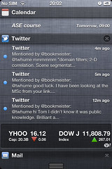
That's quite a big ask, so I've spent a few minutes running through one small but obvious new feature: the Notification Center which can now be pulled down from the top of the screen, and allows applications to request attention or leave quick-to-access information lying somewhere visible or constantly accessible.
I'll not mention the shocking similarity between this approach to notifications and the pre-existing Android feature; as Zach Epstein points out in a good comparison, WebOS at least demonstrated that there's room for something different, maybe even better.
Some observations about the Notification Center (NC) bar on iOS5, looking at it up close:
- It's easily found with the finger: Fitts's Law in good effect here, I can pull down from anywhere above the tops of the iPhone screen and drag the NC bar into visibility. It's quite helpful that the front of the iPhone is a single flat surface: there's no ridges to annoy whilst you run your finger across them, the whole movement of pulling down the NC bar;
- It's immediately useful: you can pull down the NC bar just a fraction and start seeing your most recent notification, then quickly dismiss. No need to wait for the whole thing to appear, or to completely obscure what you are otherwise doing with your phone;
- If you part-show the bar and then take your finger off the screen, there seems to be a subtle bit of logic going on to decide whether the bar should snap down and take up the whole screen, or snap up and disappear. As far as I can tell it works like this:
- If a single item in the NC bar hasn't been made visible, snap up and hide it on release (the logic being that if you've not looked at anything useful and have taken your finger off the screen, you're probably not interested in the contents of the NC);
- If more than a single item has been made visible and the last motion of your finger was downwards (i.e. you were opening it and had down so more than a minimal amount), keep opening the NC;
- Otherwise, snap it closed - you were shutting it anyway, right?
- Clicking on an item in the NC takes you through to the app that put the notification there, providing quick access to apps which need your attention;
- Other apps (weather and stocks, initially) sit permanently in the NC, at the top and bottom respectively;
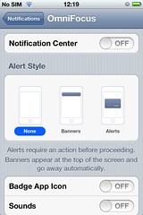
The other aspect to notifications is their appearance on the idle screen of the phone; again, configurable on a per-app basis. This brought back memories of a chat with a customer years ago; they were a mobile network operator and talked about designing for various personas, one of which was having an affair - in order to consider some interesting edge cases around privacy and floating potentially damaging messages onto the idle-screen.
The old "alert style" notifications are still available to users, on an app-by-app basis: an uncharacteristic abdication of UI responsibility from Apple, more characteristic of Android.
 Clearly useful stuff - I personally found the old notification system of modal pop-up dialog boxes irritating, as did many people. Possible areas for improvement:
- I can't seem to be able to dismiss individual notifications (though I can dismiss all from a specific app). With many apps populating the NC, it quickly becomes a long and crowded list; but having the ability to remove individual entries might engender a behaviour of "checking off" old notifications, making the whole feature more disruptive to everyday usage of your phone than it currently is;
- I can't do things from within notifications (e.g. reply to a Tweet), all I can do is sick on them to go through to the app which created them - though individual notifications can lead to screens within an app, so clicking on a Tweet in the NC bar takes me through to that tweet within Twitter. It would be nice to be able to perform basic operations on notifications, and there's clearly potential for interactivity there already: the stock application lets you drag the horizontally scrolling ticker around from within the NC bar;
