UX Brighton: Ethnography
 I'm camped out at UX Brighton, which tonight is hosted at the rather splendid offices of iCrossing. Topic: ethnography, "the antithesis of lab research" as Harry puts it - or "stalking with permission".
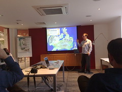
Simon Johnson of Flow
Simon's a usability consultant for Flow Interactive, presenting a project for the environment agency on "flood risk maps". The site launched and was a disaster - people sued, lots of bad press, etc. 10 years later they decided to redevelop it.
The data was iffy - poor maps, uncertain models for coastal erosion etc - but they wanted to reassure the public without getting appalling press, worrying insurers or mortgage companies, and so forth.
Scope of the project: work out what the map should look like, and what information should accompany it. They wanted to go out into the field to get context for their findings, so they interviewed 8 professionals, 6 members of the public in high-risk Norfolk, and 6 in low-risk Hastings.
They discovered that "our coastline is an institution, our history and it evokes strong feelings". Surrender goes against our national character. Ethnography is to take these passions and to bring these stories out of the community. The people making decisions need to feel the pain of the public.
Implications: the environment agency needed to communicate that they care, avoid being clinical, explain that adaption is part of our history, and show what's being done.
Three big issues: people trust locals not government. They're alarmed by coastal erosion maps. There's lots of ignorance and myths - e.g. the government is deliberately sacrificing Norfolk to save London. The mistrust was a shock to the Environment Agency, which spends millions each year protecting the coast. The locals didn't feel engaged by the EA.
"The public don't define their communities in terms of cost/benefit".
Bigs up Clearleft and Silverback :)
 They used it to record people using Google to look up coastal erosion data. Zoomed-in data was the only thing they found useful. They don't care about regional abstractions, they care about their house. The professional perspective, which was on general trends and geomorphology, wasn't relevant - even for those whose homes were strongly at risk. Professionals think of the coast as an object, science, career. Everyday people think of it as a place where they walk their dog.
This study completely changed their idea of what usability was. They thought it was asking the user what they wanted and giving them it... but realised it wasn't just about technology.
Part of their ethnography was looking at other places that might have done this stuff - but no-one has because "it's complicated and a stupid idea".
They discovered that users wanted simple, straightforward language - not "weasel words". They got their findings up onto the walls as posters, invited the client back and walked them around the room - "like they walked into the data".
They found most of the country is protected. Millions of people don't have to worry about this stuff - and don't want to be scared by "erosion", or "risk maps". A minority (maybe a 1000 houses) who really do have to worry - and need to know how much they should worry.
The EA has a duty to represent risk proportionally. They shouldn't focus on risk and erosion, but support, defence and nature - a significant change in the orientation of the site.
Practically, the scale of maps wasn't sufficient for representing this data (which constantly changes). Users didn't want jargon, alarmism, exaggeration. They wanted local news, sympathy, and summaries.
They took all the questions they had from interviews, did affinity clustering to group them, A structure emerged over time, leading to a site map.
When presenting data, users wanted a simple draggable map - but the EA had divided the country into discrete areas, meaning they couldn't support this - it was a design problem that was impossible to solve. They cut down text and got rid of expert jargon from geomorphologists, etc.. They could have users click through regional maps down to a 1:50000 scale. On this scale, large changes can occur - 16 foot of coast lost overnight (rare but possible). They overlaid keyed visualisation data onto these coastal maps, explaining what was being done on a piece of coast. Maps included enough detail for viewers to orient themselves - monuments etc., but not all streets.
With erosion: the science is rubbish; the data is rubbish; and it's out of date. They abstracted data away from the map, using indicative colour rather than scale-diagram projections.
The EA pointed out that the findings from this Flow project didn't match the scope of it. They had to get approval from Hilary Benn to get approval for this approach to go forwards. But they weren't a difficult client, they were very open. Heartfelt personal testimony from members of the public (made homeless by coastal erosion in some cases) counted for a lot here.
Q: (James Page) How long did you live in St Leonards for?
A: Spent 2 weeks there, as much time as possible outdoors. The attitude from some of the pensioners was "I don't care who takes care of stuff or why - it's someone else's problem".
Q: Is that enough?
A: It's better than nothing. How much can you have? Some people have lived there for 60 years. When people shout at you that you're from London and don't care about them, you've heard a strong message. Comparing plans from DEFRA to what I was hearing from people, there was a mismatch.
Q: I'm sceptical as to whether this is ethnography. But how confident are you that agencies will deliver the volume of content needed, and what will happen if they don't - will it be useless?
A: They already had a mandate to gather this data - this gave them more of a reason. All the local authority people wanted to get involved - they get little money, work long hours, and they're passionate about what they do.
Q: How long did you spend on each stage of the project?
A: Felt like years! Whole thing was about 5 months. I've been asked to speak another 6 times at DEFRA and various committees.
Q: How many were on the project?
A: I did the research and report, Claire sanity-checked it and structured my time. She was a really good editor.
Q: Is this ethnography at all? It sounds like lab-based study from the seaside, not watching people use the product in the environment. It's doing user interviews in their context.
A: The second time definitely, the first time there was no product so I was in their environment talking to them.
Miles Rochford, Designing for the Rest of the World, Nokia
 This is based on a 6-month project on Nokia Life Tools, and Rapid Ethnography. Miles works 2-3 years out on a team in service design. Previously worked on the National Public Toilet Map project in Australia, visited the World Toilet Forum in Shanghai. Amusing project, but actually impacted peoples lives.
Team is 40-50 people split between SF, London, Helsinki: 14 nationalities, 10 languages. This project had India, Singapore, UK and USA.
Life Tools was announced November 2008, began 8-10m beforehand. It's about services in emerging markets: agriculture, education, entertainment. What opportunities were here? Using very low-end devices retailing for 25-30 euros. Initial release used SMS as a data bearer, meaning it can work on low-end device and has a degree of cost control.
Miles' team was brought in for research and "colouring in". The project needed more than this. The motto of life tools was "inform, involve, empower" (sounds suspiciously BBC-like!).
Rapid ethnography: design ethnography, qualitative validation ("colouring in"), quantitative validation (more around business models).
The team went to India, Nigeria, Brazil, and Egypt. It was challenging for some designers because it was the first time they'd done this kind of research. There were security concerns; on arrival at Lagos their designer was met by an entourage of bodyguards, who fortunately stepped back when he was doing research and interviews :)
They interviewed a Nigerian pig farmer, using the first entry in his address book to store his income from the last 6 months.
90 participants in 6 countries, over just 2 weeks. Not a market research-driven approach, but rather looked at individuals involved in the various areas (farmers, farm produce purchasers, etc.)
Aim was to understand needs, aspirations and behaviour: how they behave, not how they say they do.
Nokia work with research agencies and put designers out in the field, to ask questions and understand things on a very personal level.
8 simple observations: people are time rich, money poor; it's not what you know but who; order through chaos; no private space or things; context is king; culture of fixing everything; expect the unexpected; stay on the beaten path.
Approach was constrained by the timeline; after the field trip they had 1 week brainstorming, 2 weeks visualising, 2 weeks subsequent fieldwork, 2 days filtering.
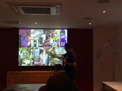
Shows project room for brainstorming.
3-frame illustrations for each concept: show problem, solution and outcome. Representation of money across cultures was strange - some (e.g. Nigeria) don't have coins. Some have notes but don't deal with them day-to-day because they're so high-value. Clothing in illustrations was a problem (e.g. exposed sleeves of women).
To relate deliverables back to people in the field, we used "design cluedo": "Would this work for person X in place Y at time Z?".
Most people working on this project had fallen into this from Multimedia Design - doing cameras, gallery interfaces, etc.
Speaks about design styles, referencing this article from Jared Spool.
 Another approach: Doug Bowman from Twitter talking about data becoming a crutch for every decision. When Amazon went down this path before, they ended up with a muddled design where individual decisions made sense, but the whole didn't - and they've improved now. What's the answer? Let designers listen. Empathy is the best tool for designers, not sketching - unless you're designing for yourself.
Q: In the intro Harry referred to ethnography as "expensive but effective". Miles talked about rapid ethnography being a 6-week project. One of the things which I remember popularising usbility was an essay by Jakob Nielsen on "discount usability" - simple tactics for realising many of the benefits of a usability study cheaply and easily, potentially in a day or so. Is there an equivalent "discount ethnography" or is this a discipline only available to those with more time or money?
A: Use ex-pats in the locations where we have offices. Do interviews like the examples from Flow's talk for local projects - just spend an afternoon with users and listne to them. There is no such thing as mobile design, its all mobile - everything needs to be mobile-aware nowadays. Look at other old research. Adaptibe path releasing India research under Creative Commons licenses.
Q: Before Melonovsky came up with the idea of ethnography, researchers visited locations but didn't live there. Is what you've done ethnography?
A: Jan Chipchase did some research a few years back, living in slums. There are lots of challenges with this - Westerners aren't built for doing this. One researcher last year became ill with an unknown malarial virus as a result of this. It's hard to get people to engage with you and let you into their lives for this period of time. Using local researchers helps break down barriers between you and the community.
Q: Do we call it ethnography because it's the closest term we have, or should we have a new term?
A: It's a form of design research, ethnography is a field not an activity.
Q: One benefit of using the term "ethnography" is that it sells better than "field research". It's expensive to get empathy. Does Nokia have any plans to leak out ROI details on this project?
A: One nice thing about working with emerging markets is scale - it's not a narrow area where ROI needs to be greater. This can be multiplied across markets, so is easier to justify. We're looking to work with tourists too, to keep costs down.
Q: Why are Nokia interested in emerging markets where there's comparitively less disposable income?
A: Emphasis is shifting from hardware to software. People have the lumps of plastic and metal, how do we make money from them?
Q: Could you move your whole team abroad to develop a product?
A: Nokia Research has facilities in many territories. Sometimes we collaborate with universities in say India or Brazil. Maybe in the late stages more than early.
Q: Have you any sense of being involved in this research? Has it changed your perception of how mobile will be used?
A: Definitely. I was surprised at how people used mobile as just another tool - e.g. a fisherman who dropped his phone into the water, but kept retrieving it. Phones may be expensive but owners aren't precious about them in the way we sometimes are in developed markets. Mental models of digital space is interesting - in emerging markets, wider shallower hierarchies work better than narrow deep ones. These cultures aren't as attuned to deep hierarchies. There are obviously issues around literacy etc too.
More presentations from Miles here.